Summary: Maximum Temperature vs. Latitude

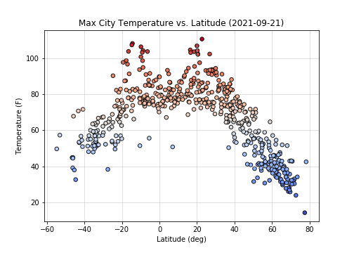
This plot visualizes the maximum temperature of cities versus their latitudes. As expected, the farther the cities get from the equator the colder the maximum temperature observation.

This plot visualizes the maximum temperature of cities versus their latitudes. As expected, the farther the cities get from the equator the colder the maximum temperature observation.